
BOX-SHADOW : BORDER 바로 밖에 그림을 그릴 수 있게 도와주는 옵션
BOX-SHADOW INSERT : BORDER 바로 안에 그림을 그릴 수 있게 도와주는 옵션
box-sizing : border-box 예제
<div style="background:red">
</div><div style="background:blue; box-sizing:border-box"></div>

<style>
    div{width:100px; height:100px; padding:10px; border:10px dashed #000; display:inline-block}
</style>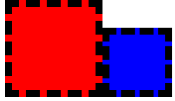
위와 같이 box-sizing:border-box인 경우(blue)에서는 padding과 border 모두 합쳐서 가로, 세로가 100px을 차지하지만
box-sizing을 설정하지 않은 경우(red)에서는 100px에서 padding, border이 합친 크기로 그려진다.
box-shadow 예제
<style>
    div{width:100px; height:100px; padding:10px; border:10px dashed #000; display:inline-block}
</style>

<div style="background:blue;
    box-shadow:
        0 0 0 10px #aa0,
        0 0 0 20px #0a0,
        inset 0 0 0 10px #aa0,
        inset 0 0 0 20px #0a0">
</div>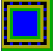
box-shadow를 위와 같이 중첩해서 여러 개 사용할 수 있는데 각각을 사용할 때 마다 충첩되서 그려지며 실행은 맨 아래의 코드에서부터 실행이 된다. **box-shadow는 위에서부터 차례대로 그려지는 것이 아니라 반대로 그려진다는 것을 유의해야 한다.
++ 추가로 box-shadow는 border-radius를 따라와서 shadow 부분까지 둥글게 그릴 수 있다. outline과 stitched 같은 것도 알아두면 좋다.
@keyframes
@keyframes를 이용해 JS없이 애니메이션을 만들 수도 있다.
